
Smartphone App Navigation Redesign
Transforming feature discoverability and user flow through strategic navigation architecture
Problem Statement
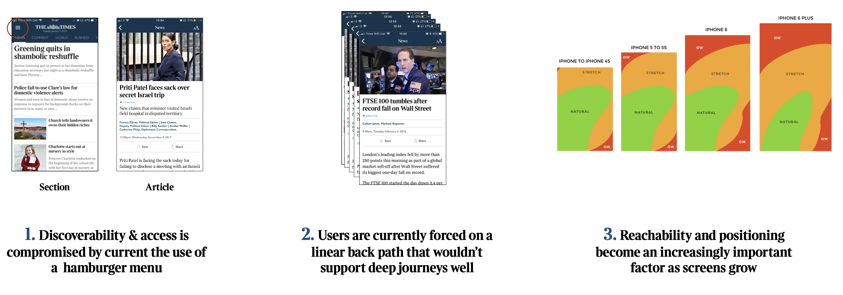
The smartphone app's existing hamburger menu-based navigation was creating significant user experience challenges as the product evolved. Analysis revealed several critical issues impacting user engagement and feature adoption:
Core Problems Identified:
- Limited feature discoverability due to nav items being hidden in the hamburger menu
- Restrictive navigation patterns preventing fluid content exploration
- Ergonomic challenges with control placement on larger device screens
- Scalability constraints as new features were introduced
This analysis indicated the need for a comprehensive navigation strategy that could accommodate product growth while improving user task completion and feature utilisation.
Project Objectives
The redesign aimed to address fundamental navigation challenges through strategic UX improvements:
- Increase visibility and accessibility of core application features
- Enable seamless user journeys across different content areas
- Develop scalable architecture to support future feature integration
- Maintain optimal reading experience without navigation interference
Role and Responsibilities
As the lead UX Designer, I led the research, analysis, design, testing and validation of the smart phone navigation end to end. Keeping necessary stakeholders informed throughout the process:
Research and Analysis:
- Conducted comprehensive competitive analysis of navigation patterns
- Led quantitative data analysis using analytics platforms
- Designed and executed qualitative user research studies
Design Development:
- Created multiple navigation concepts and interactive prototypes
- Facilitated iterative design validation through user testing
- Collaborated with engineering and product teams on implementation feasibility
Project Management:
- Coordinated cross-functional stakeholder alignment
- Managed project timeline and deliverable milestones
Research and Data Analysis
Quantitative Analysis (Omniture Analytics):
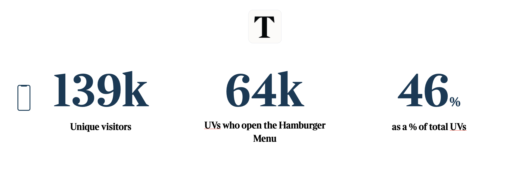
- Total monthly unique visitors: 139k
- Hamburger menu engagement: 64k users (46% of total unique visitors)
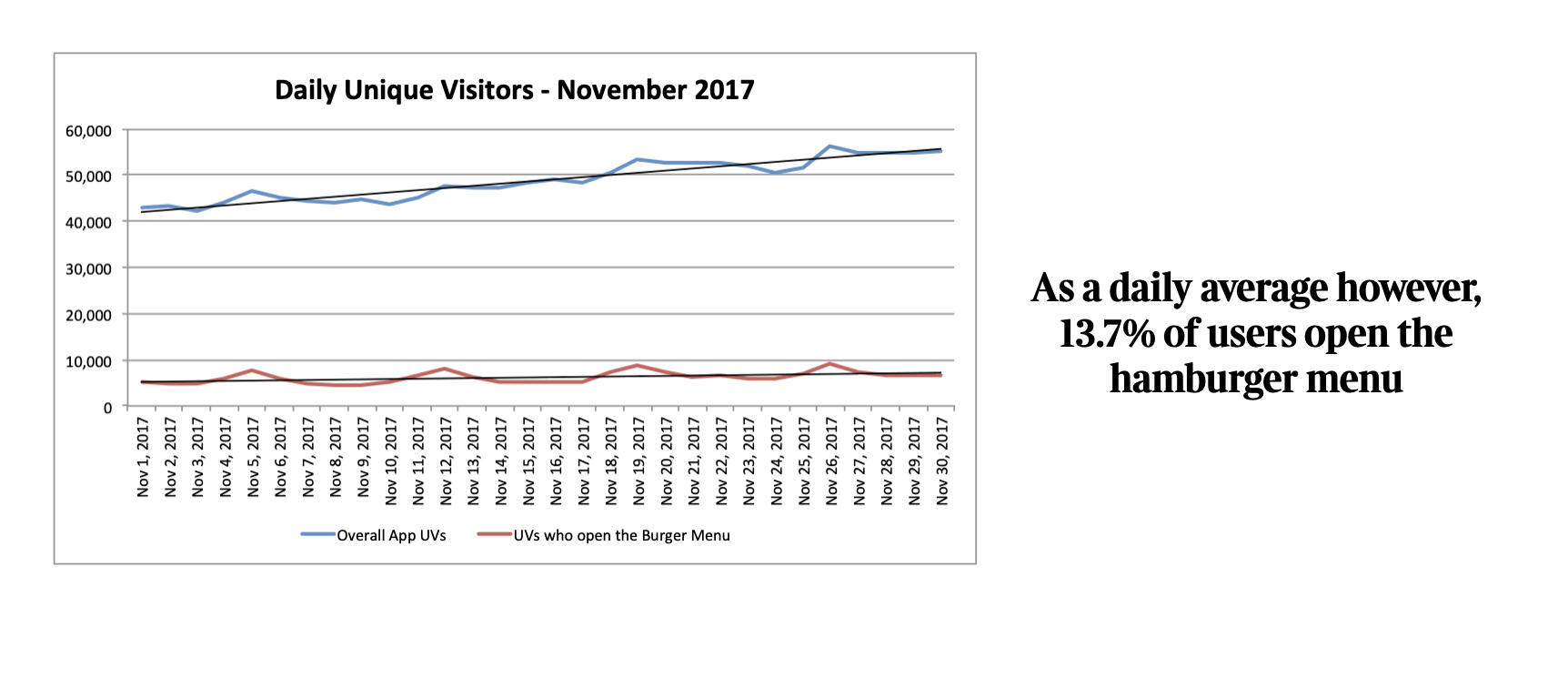
- Daily hamburger menu usage: Only 13.7% of daily active users
- Content navigation patterns: 76% of article pageviews originated from in-content navigation
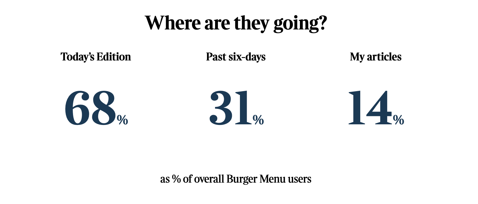
- Feature utilization ranking: Today's Edition, Past Six Days, My Articles represented highest-traffic destinations
Qualitative Research Findings:
User interviews revealed specific pain points with existing navigation structure:
- Menu depth and organization created cognitive overhead
- Users demonstrated distinct mental models separating account management from content navigation
- Strong preference expressed for enhanced personalized content visibility
The data clearly demonstrated that while the hamburger menu served nearly half of all users monthly, daily engagement remained critically low at 13.7%, indicating significant friction in feature discovery and access patterns.
Competitive Analysis
Analysis of market-leading mobile applications identified two primary navigation approaches:
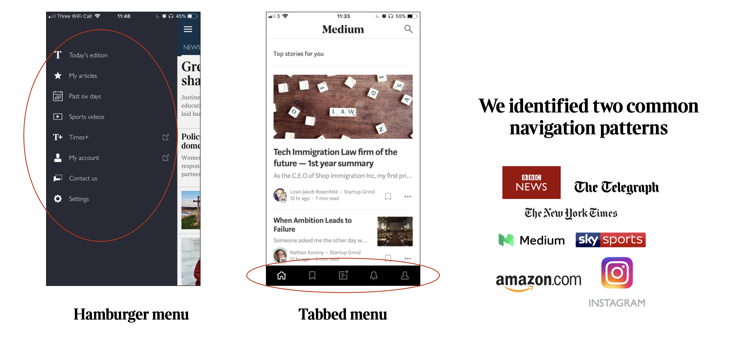
Tabbed Navigation Systems:
Pros: High discoverability; Cons: Restricted to 5/6 primary sections and takes up screen real estate
Hamburger Menu Systems:
Pros: High scalability; Cons: Reduced discoverability, lower engagement rates
Design and Testing
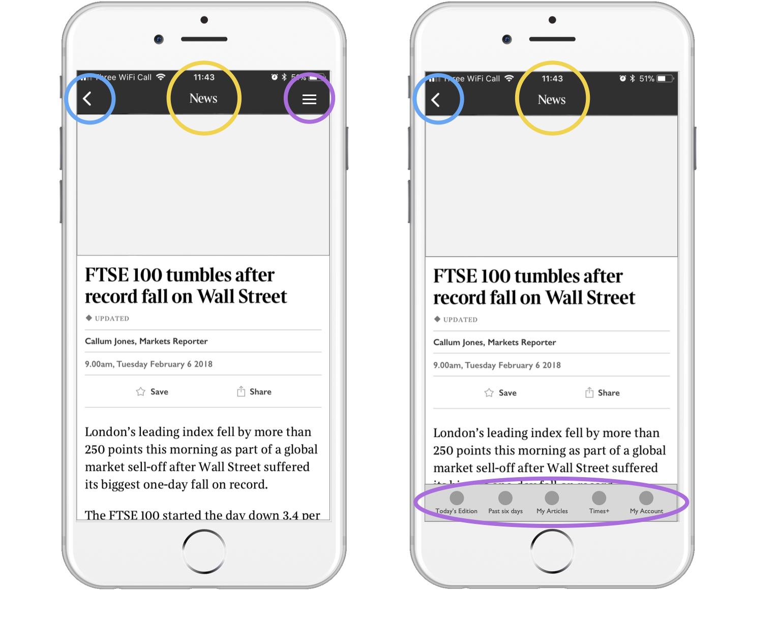
Prototype Development:
Two primary navigation concepts were developed for user validation:
- Dedicated Tab Navigation: Prominent tab bar featuring essential application sections
- Repositioned Hamburger menu: Primary features features retained in hamburger menu
Testing Methodology:
- Moderated usability sessions with 10 participants (demographic range: ages 25-55)
- Standardized task scenarios applied to both prototypes
- Mixed-methods approach combining behavioural observation and post-session interviews
Validation Results:
- Tab navigation usability rating: 80% of participants rated 5/5
- Users had strong recognition and understanding across both solutions
- We saw minimal disruption to the current experience with both scoring highly on comfortability and improving current experience
- 100% of users said the new navigation will have no negative effect on their reading experience
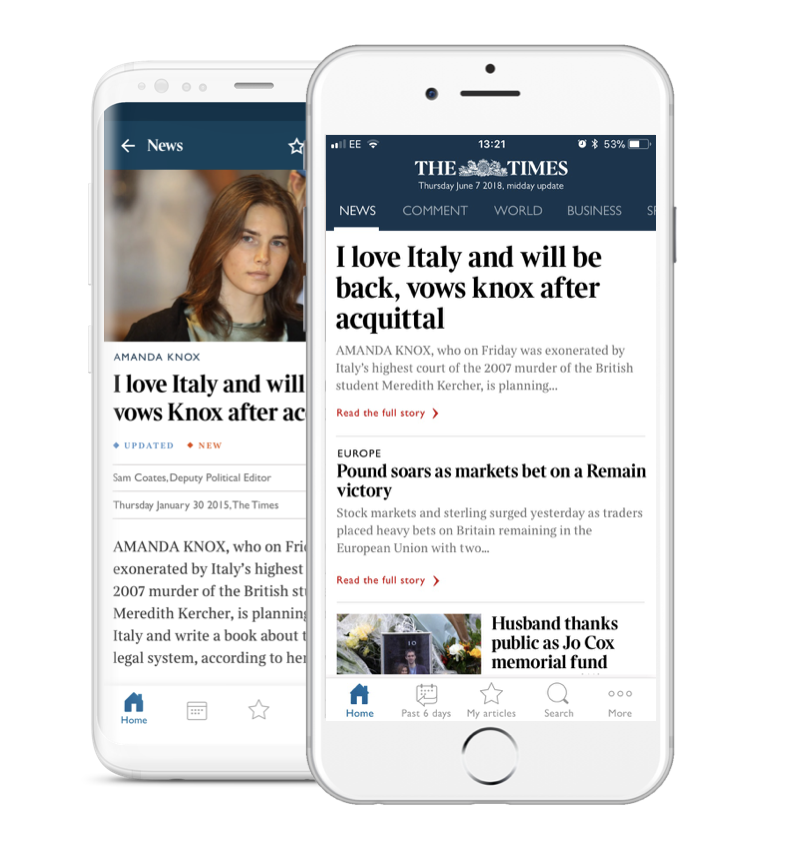
Primary Navigation Layer (Tab Bar):
- Today's Edition (highest-traffic content)
- My Articles (personalized content hub)
- Past Six Days (archive access)
- Search (content discovery)
Secondary Navigation Layer (Hamburger Menu):
- Times+ subscription features
- Account settings and preferences
- Specialized content categories
- Support and help resources
Enhanced Navigation Features:
- Context-aware return navigation in "More" section
- Intelligent content recommendations
- Streamlined deep-linking capabilities
This architecture optimizes for both immediate feature access and long-term scalability while maintaining clear information hierarchy.
Results and Impact Analysis
User Experience Metrics:
- Consistent positive usability ratings across all test cohorts
- Zero negative impact reported on existing user workflows
- Improved task completion rates for feature discovery scenarios
Business Impact:
- Enhanced feature discoverability supporting product adoption goals
- Scalable architecture enabling future feature integration without navigation redesign
- Improved user engagement patterns with previously underutilized features
Methodology and Tools
Research and Analytics:
- Omniture for quantitative behavioral analysis
- Card sorting exercises for information architecture validation
- Moderated usability testing protocols
Design and Prototyping:
- Sketch for interface design and system documentation
- InVision for interactive prototype development and stakeholder review
- Paper prototyping for rapid concept iteration
Collaboration and Documentation:
- Cross-functional design workshops
- Stakeholder presentation materials
- Implementation specification documentation
The four key images provided demonstrate the comprehensive analytical approach used throughout this project, from problem identification through data validation of the final solution.
Key Insights and Learnings
This project demonstrated the effectiveness of data-driven design decisions combined with rigorous user validation. The hybrid navigation approach successfully balanced user behavioral patterns, technical constraints, and business scalability requirements.
Strategic Takeaways:
- User behavior analytics provide crucial foundation for navigation design decisions
- Iterative testing with representative users validates design assumptions and identifies optimization opportunities
- Hybrid navigation approaches can effectively address competing usability and scalability requirements
- Cross-functional collaboration ensures technical feasibility while maintaining design integrity
Process Improvements:
- Early stakeholder alignment reduces implementation challenges
- Comprehensive competitive analysis informs strategic design direction
- Mixed-methods research approach provides both quantitative validation and qualitative insights