Central Operations Platform (COP) | Product Page Redesign
Redefining the Entry Experience for Border Force Users
Project Overview
A comprehensive redesign of the Central Operations Platform's entry experience, focusing on improving discoverability, onboarding, and user trust while aligning with GOV.UK design standards.
Role
UX Designer
Timeline
March 2020
Team
Product Manager, Designer, Developer, Solutions Architect, Content Designer, User Researcher, and Product Owner
Focus
Service Design, Journey Mapping, Heuristic Evaluation, GOV.UK Standards
Challenge
The Central Operations Platform (COP) is a critical tool used by Border Force staff to capture and manage operational data. However, users were initially directed to a bare sign-in page that lacked context, help resources, or a clear understanding of COP's purpose.
Key Issues:
- No support or onboarding content
- Poor visibility from the corporate intranet (Horizon)
- Confusing entry journey for new users
- Limited awareness of COP's full capabilities
Objective
Design a new product page and improve access journeys to:
- Support first-time and repeat users effectively
- Make COP's value clear from the first click
- Improve discoverability via internal systems like Horizon
- Align with GOV.UK usability standards
Approach
We audited seven core entry points to COP, mapped their journeys, and defined which should land on a product page versus a sign-in screen.
Key Scenarios:
- Desktop shortcut → Product Page
- Mobile home screen → Sign-In Page
- Poster campaign link → Product Page
- Email notification from Man Dec → Sign-In Page
- Horizon search → Currently broken, needs fixing
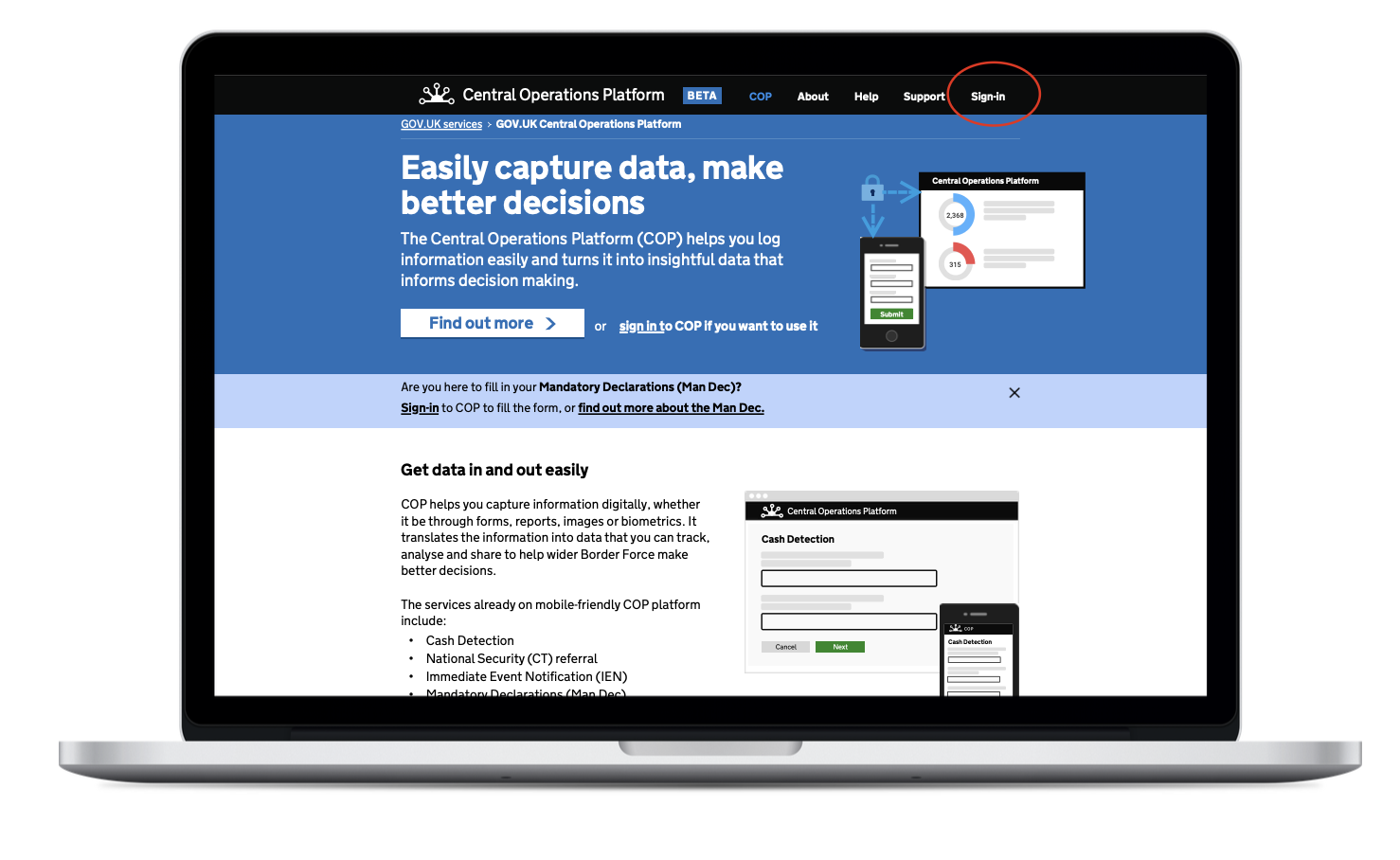
Product Page Design
The redesigned product page acts as both a gateway and a guidance tool. It introduces COP's services, encourages sign-in, and provides access to help content.
Key Features:
- GOV.UK-styled visual language
- Clear call-to-action: "Sign in to COP"
- Overview of platform features
- Onboarding resources and FAQs
- Live stats: 6,652 users · 7,500+ daily visits
The redesigned product page showing GOV.UK styling and key features.
Journey Mapping Outcomes
| Scenario | Recommended Landing |
|---|---|
| First-time user via Horizon search | Product Page |
| Repeat user via mobile home screen | Sign-In Page |
| Poster campaign or internal briefing | Product Page |
| Email trigger from a COP service | Sign-In Page |
| Bookmarked browser link | Depends on the URL |
Heuristic Review Insights
- Critical: Horizon search surfaced a Word doc instead of a live COP link
- Serious: Sign-in page offered no support or onboarding
- Positive: Users trusted the product page and found it helpful during testing
Recommendations:
- Fix Horizon search with direct COP links
- Use the product page for all browsing-style entry points
- Add help and onboarding directly within COP post sign-in
Impact
- Launched redesigned COP product page
- Entry points validated by user testing
- Clearer onboarding and support structure introduced
- Improved discoverability and user trust
- Strengthened alignment with GOV.UK design standards
Project Conclusion
This redesign enhanced the way Border Force staff engage with COP—turning disconnected journeys into a structured, user-focused experience. It set a strong foundation for further onboarding flows and in-app help content within the platform itself.